
Showing posts with label graphic design. Show all posts
Showing posts with label graphic design. Show all posts
Wednesday, May 22, 2013
Sharecost ad

Monday, February 18, 2013
Brochure, display and an ad
Here's a template brochure that I've taken a little further as for once I wasn't just provided information copy as usual. Content drives design.

This is a sponsorship sign and a series of pop-up banners.

And this is a full-page Flavours magazine ad. No copy was provided so I wrote the headline, then pulled from here and there and got to determine the structure. Made it much easier to design within the few hours I was given.

This is a sponsorship sign and a series of pop-up banners.
And this is a full-page Flavours magazine ad. No copy was provided so I wrote the headline, then pulled from here and there and got to determine the structure. Made it much easier to design within the few hours I was given.

New pieces to fit the template
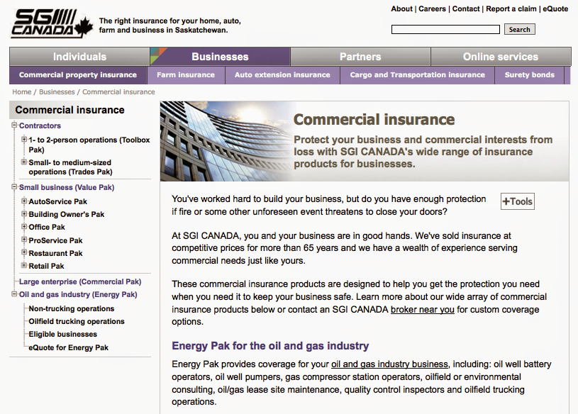
Creating a visual identity and then working within it while evolving it is a challenge. Here are some ads, templated ads, some carousel banners and screen shots of the website for our competitive insurance side.


Tuesday, August 14, 2012
Wedding shower and party invitation

A wine and cheese soirée, here's the invitation I designed to celebrate the upcoming wedding of some friends who will be getting married in November in Hawaii.

Tuesday, July 17, 2012
New visual identity
Been working on some new branding for the competitive part of our operations. It encompasses three companies operating in seven provinces. I wanted to make it flexible enough so that one day, perhaps they'll all use the same logo, but also so that we're not managing three different identities.


2011 Annual Report
The theme for this year's annual report was Changing Landscapes. Rather
that just present a traditional landscape, I used gradients of colour to
represent change. The clouds in the background imply
land below without having to show it.


Friday, March 09, 2012
Convention print materials - Better Together
Better together. This + this = better together. Plus. Addition. Chalkboard. Get it? A fun excuse rock the typography a bit.

Monday, March 05, 2012
Old rate posters, bus backs and calendar


These are all from 2003 and 2004 which is a really long time in graphic design years, all within 5 years of getting out of school.
Our provincial government used to promote our auto insurance rates so I used to do a lot of posters. On the first two I also came up with the theme/headlines as we don't have anyone to do any actual copywriting, just information writing. The calendar, bottom, was a retrospective on the province of Saskatchewan's 100th anniversary and how public insurance came to be.
Sunday, February 05, 2012
Masthead
Here's the masthead for our family blog. Though all my work is so colourful, I would love to design everything in black or one to two colours for the rest of my days...


Monday, December 26, 2011
Label

Label for a recipe book for my brother and sister-in-law to accompany the immersion blender I got them. Inspired by this: http://pinterest.com/pin/202099101997899176/
Friday, September 09, 2011
Equilibrium - Health. Family. Balance.
Here's a little logo I did for my cousin Heather's new business. I think we may have set a record as she accepted the first logo design. We only had to do some colour tweaks.

The Broker newsletter redesign
This newsletter, now in more of a magazine format, has been around since the beginning of time. Or in a different form since the 1940s when our company came to be. This is the design I am recommending, though it hasn't been approved yet. Insurance doesn't have to be ugly. But it might still be boring!


MySGI wordmark
This wordmark for our online customer self-service area hasn't really gone anywhere since I designed these two options back in May. There were a lot of bad ones before I recommended these as the best.

Web icons and e-learning skins
I don't do a lot of stuff for online, but I recently did some icons (some just modified from Shutterstock and some from scratch) for the roll out of the online services section of our new website.


I also did these "skins" (like slapping on your brand) for our e-learning training site.
Corporate Strategies illustration
This corporate strategies illustration was from early in 2010 before I went on maternity leave. It never went anywhere.

Saturday, August 06, 2011
Another year, another birthday party invitation
This year, Lily wanted an ice cream birthday party. Viola! An ice cream birthday party invitation, complete with a cherry on top.


Monday, August 02, 2010
Alice in Wonderland birthday party invitation
Lily's 5th birthday was an Alice in Wonderland birthday party. The invitation was a collaboration between Chris and me. We photoshopped her little face into the FIVE of hearts cards and a pocket watch for the 1:00 p.m. start time.

 All the photos from her birthday party can be found here.

 All the photos from her birthday party can be found here.
Wednesday, February 17, 2010
RID - Report Impaired Drivers


 Originally designed as a city sign and highway sign, the RID (Report Impaired Drivers) identity has been adapted to billboards, bus boards and posters and has been rolled out in most cities in Saskatchewan.
Subscribe to:
Posts (Atom)
LinkWithin
