Graphic design work samples, mostly from work. Click on the image for a larger view.
Sunday, March 22, 2009
Springtime
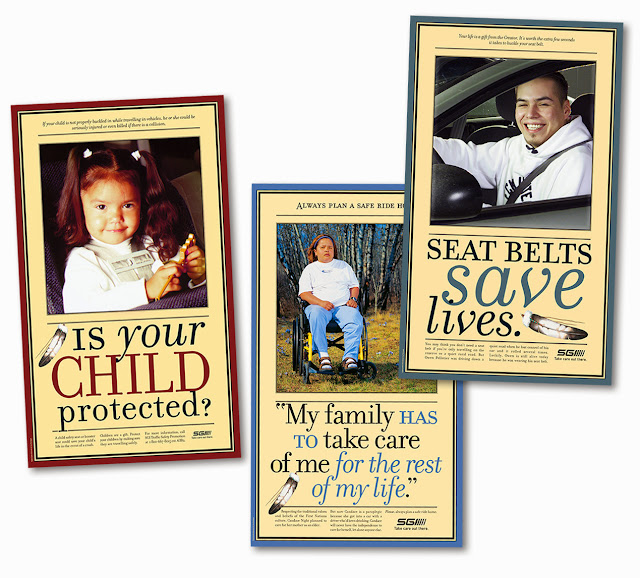
I'd forgotten about these posters. These were from a series of five or six Aboriginal safety posters that I began in 2001. They were large, over 30" in height. I was reminded of them because of the spring crocuses in the middle shot. I didn't have a lot (or any) control at these photo shoots, but those crocuses made my day.
Monday, July 21, 2008
Re-do
The illustration of a pump jack for this project had to be re-done due to similarities (okay, it was exactly the same image) with competitor materials - after three different versions of the brochures, reference sheets and folder were printed with the previous canola-laden field. But the new one, below, is better so I can't complain.


Thursday, July 03, 2008
Pretty different
What I appreciate about my job the most is the variety. It's never the same thing week after week, and I often have to finish things before I'm totally happy with them, but I do what I can given the three hours or three days I'm allowed.
Saturday, May 03, 2008
Tuesday, April 22, 2008
In the last week
 This is a sharp little flyer I whipped up for a contest in Alberta. Honing my Photoshop skills all the time. Slick.
 I was at a loss for this one. It was redesigned from its previous incarnation as a Word file with pictures. Pure evil. Chris always tells me that if there's nothing else to go on, the design should at least be competent.
Thursday, March 27, 2008
New and old
 New promotional catalogue for 2008. It was pretty sharp, an improvement on the previous two catalogues I've done. The product photos and staff models were large and the layout very clean.
 These phone cards are old, maybe even from 2003. But I still like the illustrations and still think the boy is cute since I modeled him after Chris!
Now a series
Monday, January 21, 2008
Celebrating their achievements
Party theme
Thursday, November 08, 2007
Life of the Party
Tuesday, September 18, 2007
Contest poster and prizes
Here is the third poster in the First Nation school contests promoting traffic safety, this one geared at high school kids. I have no idea what high school kids think is cool, so this is what they get. The big draw will be the iPod prizes.

And these are the 2-colour t-shirt illustrations for the winners of the grades 5 - 8 contest (Lukida) and the K - 4 contest (safety kids). It was good to do a two-colour silkscreen on something that wasn't white. Easier to use the navy of the shirt as a third colour.

And these are the 2-colour t-shirt illustrations for the winners of the grades 5 - 8 contest (Lukida) and the K - 4 contest (safety kids). It was good to do a two-colour silkscreen on something that wasn't white. Easier to use the navy of the shirt as a third colour.

Subscribe to:
Posts (Atom)


