Friday, October 09, 2009

2010 calendar


I realize these don't appear the same size at all (click on them for a larger view), but here are some spreads from the 2010 sports calendar I designed. It just went on the press yesterday after a lot of turmoil on the writing side. My vision was to have a bunch of sports facts, an extensive bio and career highlights on the premise that people that are into sports really like to read stats and stuff. And while I ultimately won in the end, though I personally didn't fight the fight, it was well worth it.

Wedding invitation

This wedding invitation was for my Auntie Norma's wedding down on the farm. They wanted it pretty casual with the "We're getting hitched" headline. I like that it's got lots of typography going on, plus what a cute little tractor. I had a barn in there in early roughs but it got too busy. The wedding was also lovely. Great weather, lots of family and a big bbq feast including cabbage rolls!

Thursday, July 30, 2009

Somebody has a birthday coming up...

I hope it's pretty obvious who it is...

This is Lily's birthday party invitation for her fourth birthday party. I really admire Helen Dardik's illustration style and tried to emulate it in this invitation we sent to our friends.

Saturday, July 11, 2009

High Five


Apparently I'm still on my yellow and black kick. High contrast or something. Anyway, this is for this year's PYAC youth conference and this is the first year I'm not considered youth. (That's okay because I feel too old to design all cool and trendy.) They, PYAC, thought high five was a good theme for their fifth anniversary and presented a clip art hand with a number five in it for our use - not that I saw it but that's how it was described to me. And it's not like the materials we develop even get used much for the conference, just the powerpoint slides (bottom and second from bottom). The poster (top) and tickets are for all other staff who would like to attend the after-conference party.

Wednesday, July 08, 2009

Summer Invasion stage banners and ad


Stage banners and newspaper ad (top) for the SGI sponsored stage at Summer Invasion at Wascana Park. Very little time went into the concept and design of this so I'm a little indifferent.

Update: The concert was good and the banners turned out pretty good - especially when compared to the stage banners from the sponsor the night before. See?

Tuesday, June 16, 2009

Promotional brochure


One design divided into two brands. Hired a local photographer, Darrel Kajati, to shoot the people. He did an awesome job. I didn't have to crop it at all as the backgrounds were perfectly white.

Wednesday, June 10, 2009

Rock Solid


This year's convention for the brokers who sell our insurance products was themed Rock Solid. I designed the logo first, then the (almost fun) registration form. There was also a convention booklet, a menu, fun night card and drink and wine tickets. All materials were 2-colours.

The main brand - an insurance company's visual identity


Designed in 2002, I've had the last seven years to build my company's visual identity - even though what I started out with was rushed and not well thought through. I'm making the best out of what could have been an inconsistent disaster.

Monday, June 08, 2009

Family Fun Day & BBQ poster and ticket


Ha, ha! There's an ant carrying away a hot dog!

The only objective I was given for this family fun day poster and ticket was to make it look fun. Apparently that's what makes people go to events like this... I like how the ticket is a mini-poster.

Update: Apparently it didn't look fun enough. They canceled the event due to poor ticket sales

Brochure illustrations

The restaurant brochure cover illustration turned out rather well while the illustration for the Garage Pak is what it is... Illustrator is fun!

Get your passport


When the enhanced driver's licence project I was working on got scrapped, we did a campaign including billboards, posters, web banners and newspaper ads to communicate to the public that as of June 1st, you will be required to carry a passport to cross the US/Canada border by land.

Web banners


In the absence of a web designer or interaction designer, I've done a handful of teeny, tiny web banners for the front page of the SGI website. I prefer print, but these do offer some instant gratification. And hone my photoshop skills...when I have the time.

Coachman brochure re-design


As there were issues with the old brochure design (below) and how the type ran vertically, I did the slightest redesign, maintaining the individual colour (of which the gamut runs from green to blue to violet), masthead at the top and the placement of the logo. When you see them all on a brochure rack, the change is actually quite subtle.

Visions & Values poster


Almost impossible to explain how our company is broken down, even confusing to staff, I tried to explain it with an intro, then by diagramming how they all relate. Of course, there wasn't enough pretty stuff and the design got scrapped.

Management meeting materials


The management meeting theme was the movies/Oscars/film festival. We did a little movie-themed magazine (like you'd find in the theatre that acted as the meeting agenda), tickets for the break-out sessions and lots of power point slides.

Air Miles buckslips


A couple of buckslips you'd find in your mail if you were a customer of ours that belonged to Air Miles.

50s Rock 'n' Roll party teaser and invitation


The theme of the party was 50s rock 'n' roll...likely because the decorations would be easy to get. The invitations were presented as full-screen PDFs.

Sunday, March 22, 2009

Springtime

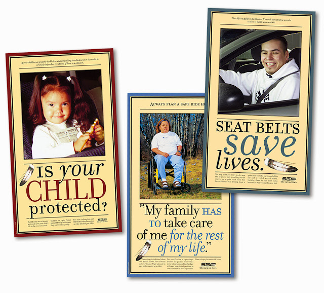
I'd forgotten about these posters. These were from a series of five or six Aboriginal safety posters that I began in 2001. They were large, over 30" in height. I was reminded of them because of the spring crocuses in the middle shot. I didn't have a lot (or any) control at these photo shoots, but those crocuses made my day.

LinkWithin

Related Posts Plugin for WordPress, Blogger...