Monday, June 08, 2009

Get your passport


When the enhanced driver's licence project I was working on got scrapped, we did a campaign including billboards, posters, web banners and newspaper ads to communicate to the public that as of June 1st, you will be required to carry a passport to cross the US/Canada border by land.

Web banners


In the absence of a web designer or interaction designer, I've done a handful of teeny, tiny web banners for the front page of the SGI website. I prefer print, but these do offer some instant gratification. And hone my photoshop skills...when I have the time.

Coachman brochure re-design


As there were issues with the old brochure design (below) and how the type ran vertically, I did the slightest redesign, maintaining the individual colour (of which the gamut runs from green to blue to violet), masthead at the top and the placement of the logo. When you see them all on a brochure rack, the change is actually quite subtle.

Visions & Values poster


Almost impossible to explain how our company is broken down, even confusing to staff, I tried to explain it with an intro, then by diagramming how they all relate. Of course, there wasn't enough pretty stuff and the design got scrapped.

Management meeting materials


The management meeting theme was the movies/Oscars/film festival. We did a little movie-themed magazine (like you'd find in the theatre that acted as the meeting agenda), tickets for the break-out sessions and lots of power point slides.

Air Miles buckslips


A couple of buckslips you'd find in your mail if you were a customer of ours that belonged to Air Miles.

50s Rock 'n' Roll party teaser and invitation


The theme of the party was 50s rock 'n' roll...likely because the decorations would be easy to get. The invitations were presented as full-screen PDFs.

Sunday, March 22, 2009

Springtime

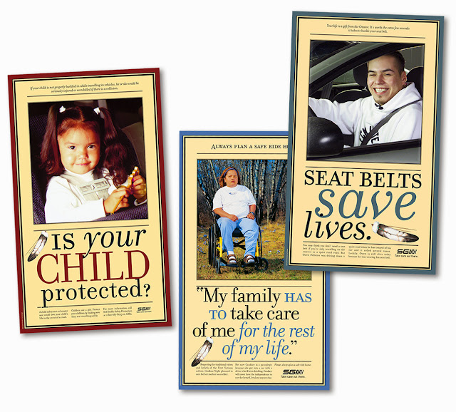
I'd forgotten about these posters. These were from a series of five or six Aboriginal safety posters that I began in 2001. They were large, over 30" in height. I was reminded of them because of the spring crocuses in the middle shot. I didn't have a lot (or any) control at these photo shoots, but those crocuses made my day.

Monday, July 21, 2008

Re-do

The illustration of a pump jack for this project had to be re-done due to similarities (okay, it was exactly the same image) with competitor materials - after three different versions of the brochures, reference sheets and folder were printed with the previous canola-laden field. But the new one, below, is better so I can't complain.

Thursday, July 03, 2008

Pretty different

What I appreciate about my job the most is the variety. It's never the same thing week after week, and I often have to finish things before I'm totally happy with them, but I do what I can given the three hours or three days I'm allowed.

Two hours, maybe. (An envelope, of which the idea will be applied to posters and tent cards.)

Four hours. (This is our youth conference identity this year.)

Three days. (An illustration for a product launch spanning three provinces and multiple applications.)

Saturday, May 03, 2008

Another flyer

Here's another flyer, this time for a contest in Manitoba.


Tuesday, April 22, 2008

In the last week

This is a sharp little flyer I whipped up for a contest in Alberta. Honing my Photoshop skills all the time. Slick.

I was at a loss for this one. It was redesigned from its previous incarnation as a Word file with pictures. Pure evil. Chris always tells me that if there's nothing else to go on, the design should at least be competent.

LinkWithin

Related Posts Plugin for WordPress, Blogger...